Case Studies: Systems, Strategy & Design
E-Commerce Ecosystem & Digital Visual Architecture
Brand Narrative | Revenue Systems | Strategic Product Hierarchy | Visual Logic
-
The business was operating with a disconnected 'visibility problem', a high-value offer ecosystem trapped behind fragmented landing pages. The customer experience felt temporary and pieced together, lacking a centralized visual identity that could guide a user from their first interaction to a high-ticket investment.
The solution wasn't just a website, it was a clearer path to purchase. I was tasked with architecting a cohesive digital storefront that transformed a scattered product list into a sophisticated, navigable brand story. By creating a unified visual hierarchy, we made the ecosystem easier to browse, easier to trust, and most importantly, easier to shop.
-
Creative Lead & Systems Architect
I spearheaded a three-month complete brand overhaul and ecosystem build. My objective was to transform a fragmented collection of pages into a high-performance "buying destination." I owned the full stack of the creative process: from visual direction and UI/UX design to the underlying systems architecture that unified the product ecosystem.
-
Designing for Zero Friction
The problem wasn't demand; it was a "cognitive load" issue. With 14+ distinct offers, the customer journey was fractured. I audited the existing architecture through a customer-first lens to identify where the narrative broke down.
My strategy focused on three pillars:
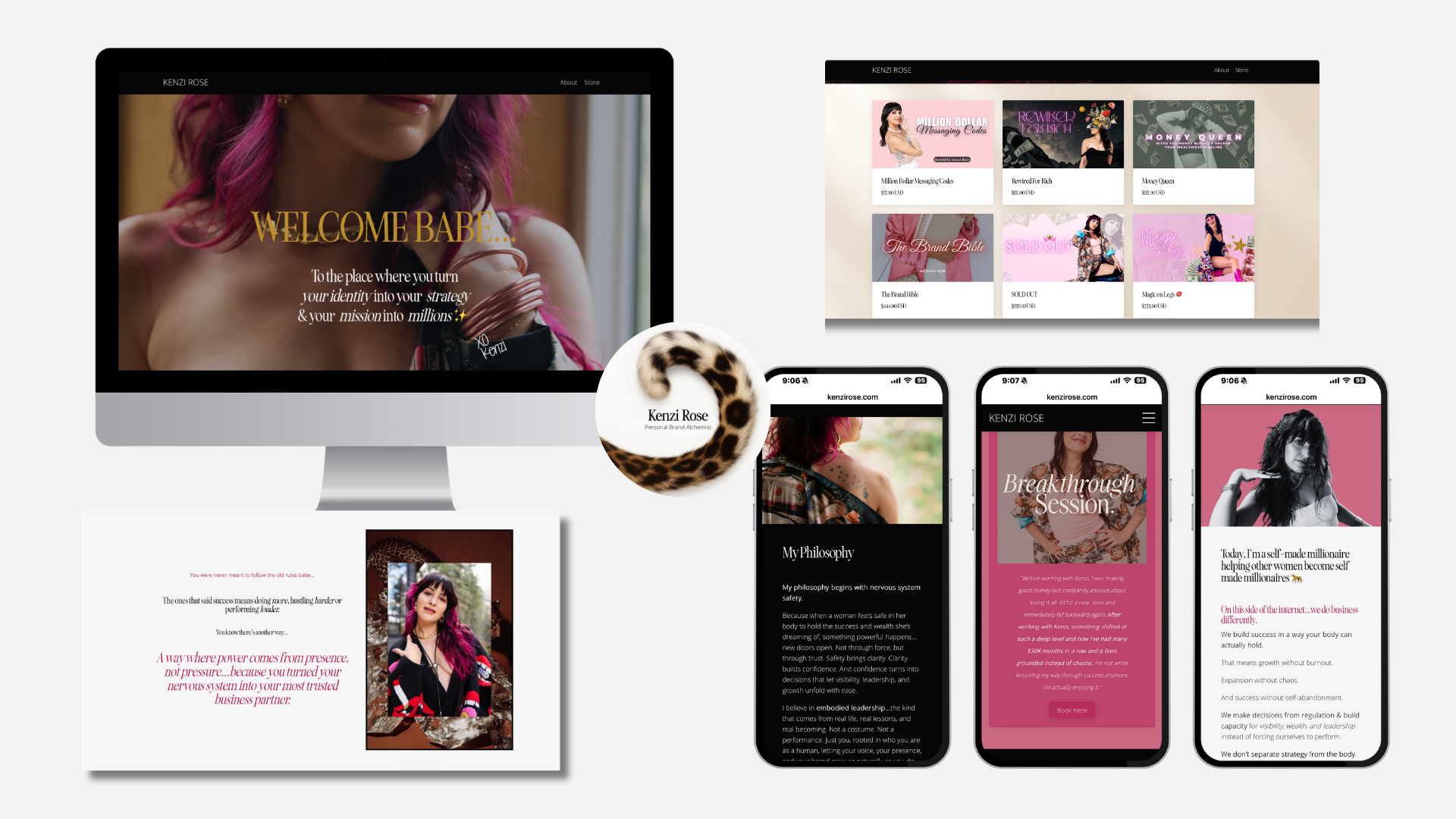
Visual Hierarchy: I categorized 9 digital products and 5 services into a logical "Start Here" framework, allowing users to self-segment instantly.
Centralized Commerce: I moved the brand away from "link-in-bio" dependency to a true digital storefront, increasing the Average Order Value (AOV) by encouraging multi-product browsing.
Momentum Mapping: I designed "next-step" triggers into each page, ensuring that every interaction, from a lead magnet to a high-ticket coaching offer, felt like a cohesive progression rather than a hard sell.
-
Scaling Consistency & Intentionality
I translated the high-level strategy into a robust digital system designed for "intentional browsing."
Visual Identity & Asset Library: I didn't just design pages; I built a brand system. I produced a library of 50+ digital marketing assets to ensure every touchpoint, from socials to checkout pages, spoke the same visual language.
System Migration: I overhauled the Kajabi infrastructure to support an automated "Storefront Model," effectively turning the website into a 24/7 salesperson.
Navigable Environments: By prioritizing UX clarity, I ensured users could orient themselves within seconds, reducing the "bounce rate" caused by cognitive overwhelm.
-
Proof of Concept & Revenue Growth
The redesign transformed the site from a passive brand presence into a high-conversion sales tool.
Immediate ROI: Generated 8 organic sales in the first 15 days (effectively moving from $0 to $3,500+ in revenue) with an Average Order Value of $444.
Ecosystem Discovery: Multi-product visibility led to a spike in "cross-shopping," making high-ticket coaching offers visible to customers entering through low-ticket digital products.
Operational Speed: The creation of the 50+ asset library gave the business the agility to launch new promotions instantly without creative bottlenecks.
-
What This Reflects: This project is a blueprint for my approach to creative leadership: I don't just solve for aesthetics, I solve for clarity and conversion.
It reflects my ability to architect a digital ecosystem where structure, hierarchy, and design serve a singular business objective. My value lies in my capacity to synthesize complex product lines into intuitive user journeys, ensuring that a brand is as functional as it is beautiful. I don't just make a site look better; I make a business more scalable.
The client later shared this reflection:
“I truly appreciate you and the work you’ve done. I love what you’ve created and I want you to know that I am so satisfied with the end result. A lot of this project unfolded during a personally complex season for me, and building an online identity in that space was hard. Your support and creative input helped me more than you probably realize, and I’m really grateful for that.”
THE BLUEPRINT
Client Type: Online Business Coach (High-Ticket & Digital Product Model)
Platform: Kajabi (Customized Ecosystem Build)
The Complexity: 9 Digital Products | 3 Coaching Offers | 2 Lead Magnets
My Scope: Full Rebrand, Site Architecture (Homepage, About, Store, Landing Pages), Custom Visual System, and 50+ Marketing Assets.
Timeline: 3-Month Strategic Engagement
THE IMPACT
Conversion Shift: From $0 site-driven revenue to 8 organic sales in the first 15 days.
High-Value Action: Achieved a $444 Average Order Value (AOV) through organic browsing alone.
Operational Scale: Delivered a visual system that allowed the client to launch new promotions 5x faster using the custom asset library.
The Innovator’s Note:
“The challenge here wasn't a lack of quality; it was a cognitive load issue. I approached this not as a 'redesign,' but as a structural overhaul. My goal was to treat 14+ disconnected offers as a single, unified journey. I’m most proud of how we turned a static brand presence into a self-sustaining revenue engine by simply removing the friction between 'curiosity' and 'purchase.”
The Ripple Theory: Community Engagement System & Identity Architecture
Building a high-growth, referral-based network through visual trust, automated onboarding, and multi-channel storytelling.
-
Building a space people actually want to come back to.
Professional networking often feels stiff and transactional. My goal was to flip that script. I wanted to build a community where connection came first and relationships grew naturally, not through forced "networking," but through a well-designed experience.
The real challenge wasn't just hosting events; it was reducing the friction of belonging. I needed to solve for:
Clarity: Making sure the "value" was obvious within seconds of landing on our page.
Consistency: Ensuring the "vibe" they felt in an email matched the one they felt walking into the room.
Trust: Building a system so reliable that people felt proud to recommend it to their closest peers.
-
Co-Founder & Experience Architect
I lead the creative direction and communications infrastructure that makes The Ripple Theory feel seamless. My focus is on removing barriers to participation by designing every touchpoint of the member journey.
I own the end-to-end "Visual & Verbal" experience, which includes:
System Design: Managing the flow of communication, from the initial landing page and onboarding sequence to event recaps and member updates.
Brand Cohesion: Shaping the visual identity and voice so that the community feels like the same high-trust environment, whether someone is scrolling online or walking into a physical event.
Operational Momentum: I built and managed the "Content Flywheel," ensuring information is always current and the brand stays top-of-mind without feeling cluttered or overwhelming.
-
Designing for Momentum & Belonging
My strategy was built on one guiding principle: Every friction point is an exit ramp. If the registration process feels clunky or the tone feels stiff, members disengage before the "magic" of the IRL event even happens.
My approach focused on three strategic pillars:
Removing Friction from the Funnel: I audited the RSVP and onboarding flows to identify where we were losing people. By streamlining the technical steps and rewriting the copy to be more intuitive, I turned a "clunky" process into a clear, inviting path to entry.
Structuring the In-Between: I recognized that the "Product" (the community) doesn't end when the event does. After observing 10+ event cycles, I developed a communication framework to bridge the gap between monthly gatherings, ensuring member retention stayed high between IRL meetups.
The "Welcome" as a Brand Asset: I treated our brand voice as a logistical tool. By maintaining a consistent, warm, and professional tone across every touchpoint, from automated reminders to event recaps, I ensured that the feeling of the community was scalable and predictable.
The goal was never "polish" for its own sake; it was to use design and communication to make participation feel effortless.
-
I built the experience around the community from the ground up, starting with the systems people moved through first.
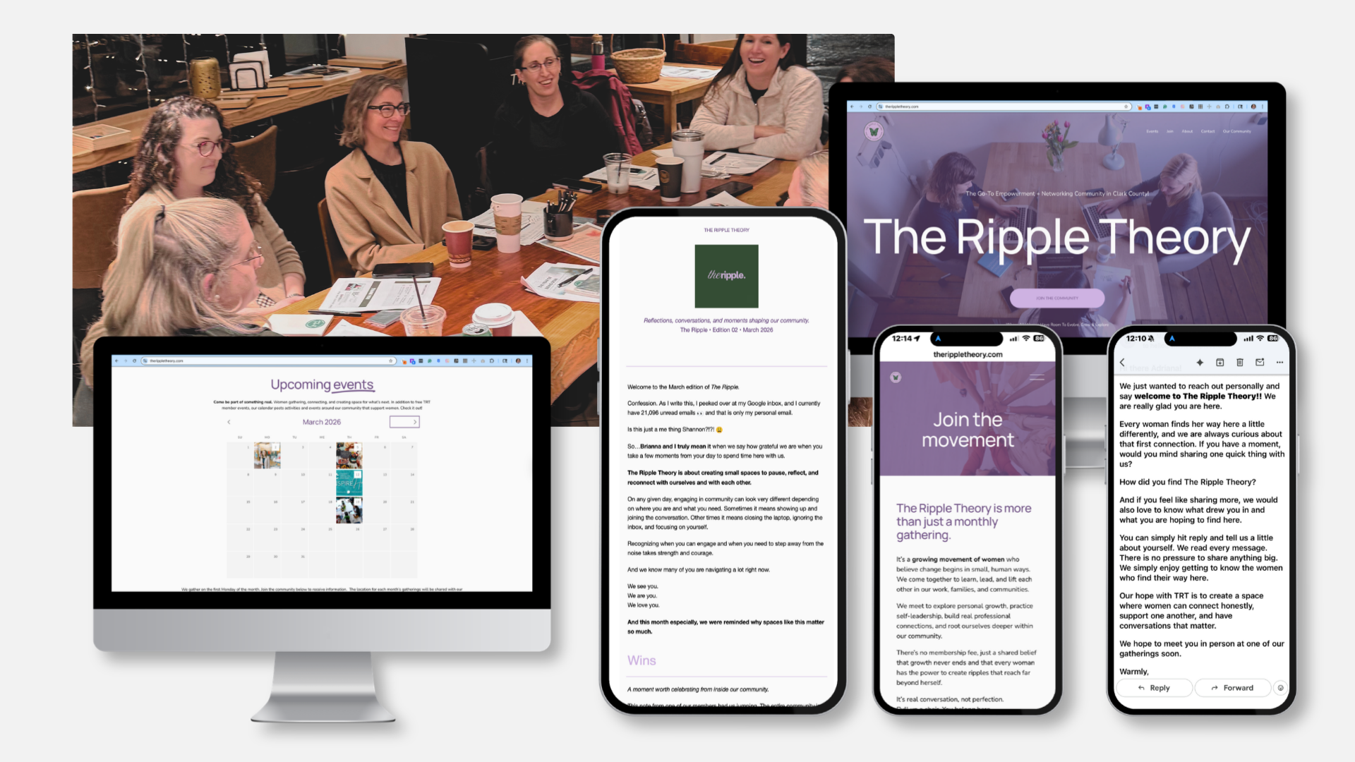
That began with the registration process. Early on, there was too much confusion around RSVP flow and too little clarity around how people signed up for the newsletter and membership. I chose the tools, redesigned the process, and rewrote the copy around it so the path in felt more straightforward from the start. The goal was to remove friction before it had a chance to turn into drop-off.
From there, I built the communication system that supports the community month to month. I write and manage the welcome emails, RSVP reminders, newsletter content, post-event recaps, and follow-up communication that keep people informed before and after each gathering. I also maintain the planning structure behind that work so the communication stays steady and intentional instead of turning reactive at the last minute.
The website is part of that experience too. I write the copy, keep key pages updated, and make sure members can find accurate information without running into outdated details, broken links, or unnecessary confusion. That ongoing upkeep is not glamorous, but it changes how a community feels. People notice when the digital side of something is current, clear, and cared for.
I also created the visual system used across email, web, events, and social platforms so the experience feels more cohesive wherever someone encounters it. That included more than 25 visual assets across four channels, all designed to make The Ripple Theory more recognizable and more consistent over time.
Taken together, those decisions created a smoother experience from first interest through continued participation. People were not left piecing things together on their own. The process made more sense, the communication felt more connected, and the community became easier to step into and stay part of.
-
THE IMPACT: A Community Built on Trust & Systems
The most significant result is that The Ripple Theory has grown to a high-retention community 100% through referrals. We have used zero paid acquisition. People join and stay because the system of trust and the quality of the experience make it easy to recommend.
Key Performance Indicators:
Industry-Leading Engagement: We have maintained a 73% average email open rate across all touchpoints (reminders, recaps, and onboarding). This proves our communication isn't just "noise", it’s anticipated and valued by our members.
Proof of Consistency: Successfully executed 10 consecutive monthly events with steady attendance. This consistency proves the scalability of the brand and the durability of the member journey I designed.
Word-of-Mouth Engine: Our referral-only model is a direct result of the "Visual Trust" we’ve built. When the brand feels established and the path to entry is frictionless, members become our most effective marketing team.
The Qualitative Shift: The most frequent feedback we receive is: “This feels different from other networking groups.” This confirms that by centering genuine connection in our design and communication strategy, we successfully moved away from the "transactional" feeling of traditional networking toward a high-trust professional ecosystem.
-
What this reflects of my lead-level capabilities.
This project demonstrates my ability to take a vision from 0 to 1 by building the creative and operational infrastructure necessary for long-term growth. It shows I can manage high-level brand storytelling while obsessing over the small UX details that actually drive retention.
The Innovator’s Note:
"Community is just a series of shared experiences. With The Ripple Theory, I wanted to prove that a professional community could feel as polished as a premium consumer brand. My focus was on 'Visual Trust', creating a design system so consistent and intentional that high-level professionals felt an immediate sense of belonging before they even walked into the room."
What stands out most is how the experience feels to the people in it. One member put it this way:
“I finally figured out what makes this feel so different from other networking groups. I feel equal here.”
THE BLUEPRINT
Organization: The Ripple Theory
Community Model: Referral-Locked Women’s Network
Role: Co-Founder & Experience Architect
Scale: 10 Consecutive Monthly Events (and counting)
Systems Scope: Lifecycle Onboarding, Registration CX, Visual Identity System, Content Strategy, and Full-Stack Copywriting.
Objective: Architecting a high-trust environment that converts digital interest into IRL advocacy.
THE IMPACT
Growth: 100% Organic (Direct Referral Model)
Attention: 73% Average Open Rate (3x Industry Standard)
Retention: Established a "Trust-First" framework that consistently drives repeat attendance and member-led expansion.